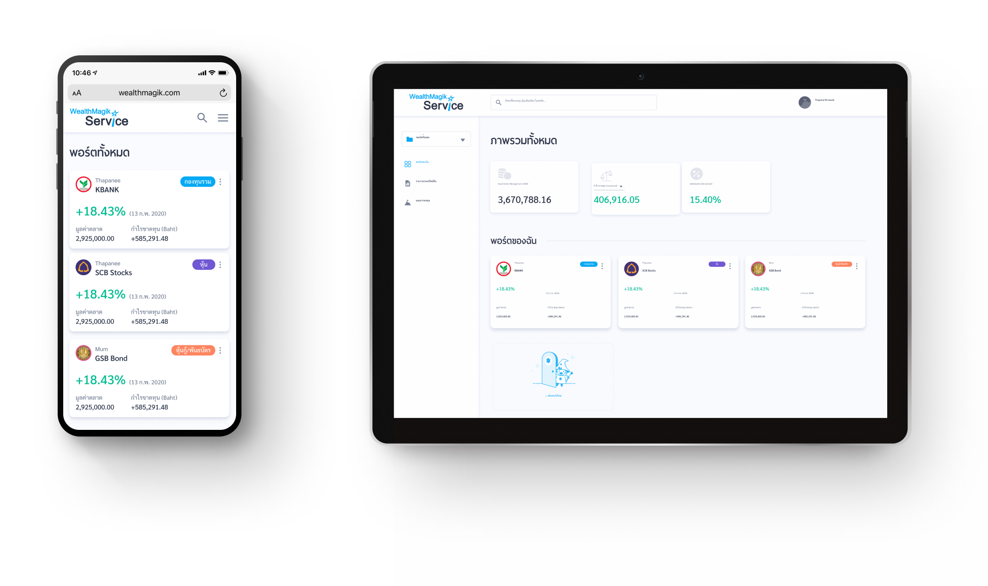
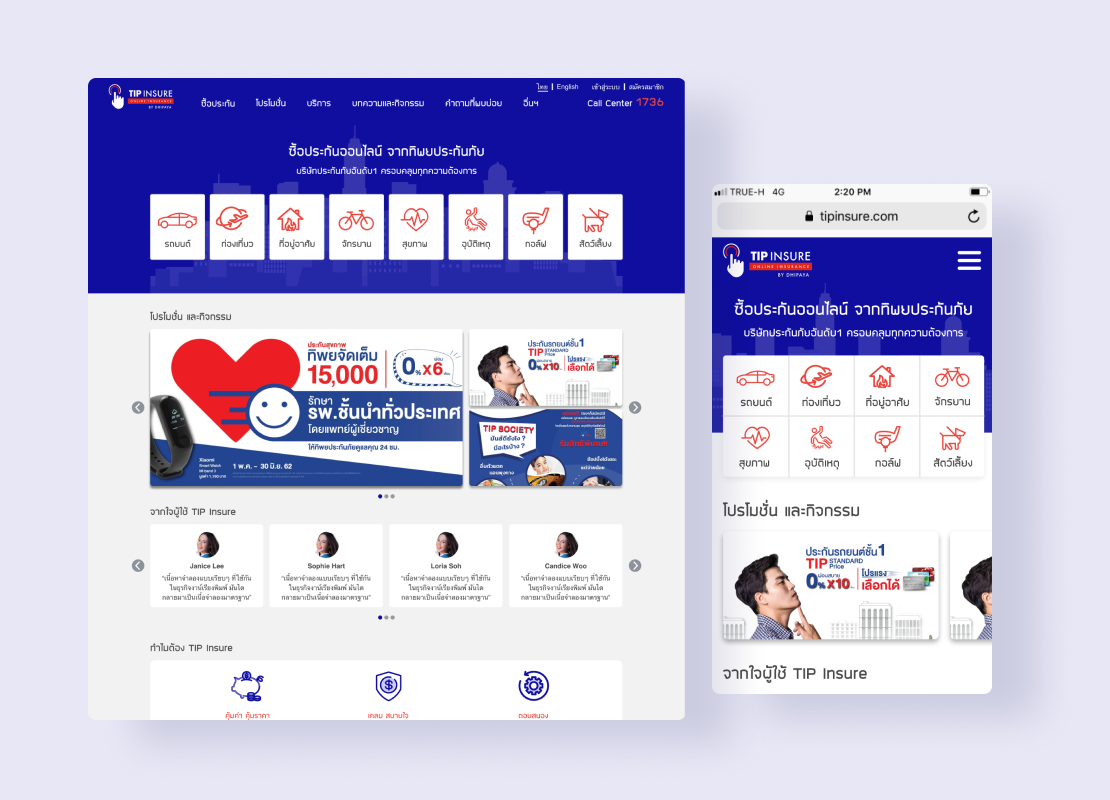
WealthMagik - Fund Info Provider
All-in-one Investment Portfolio
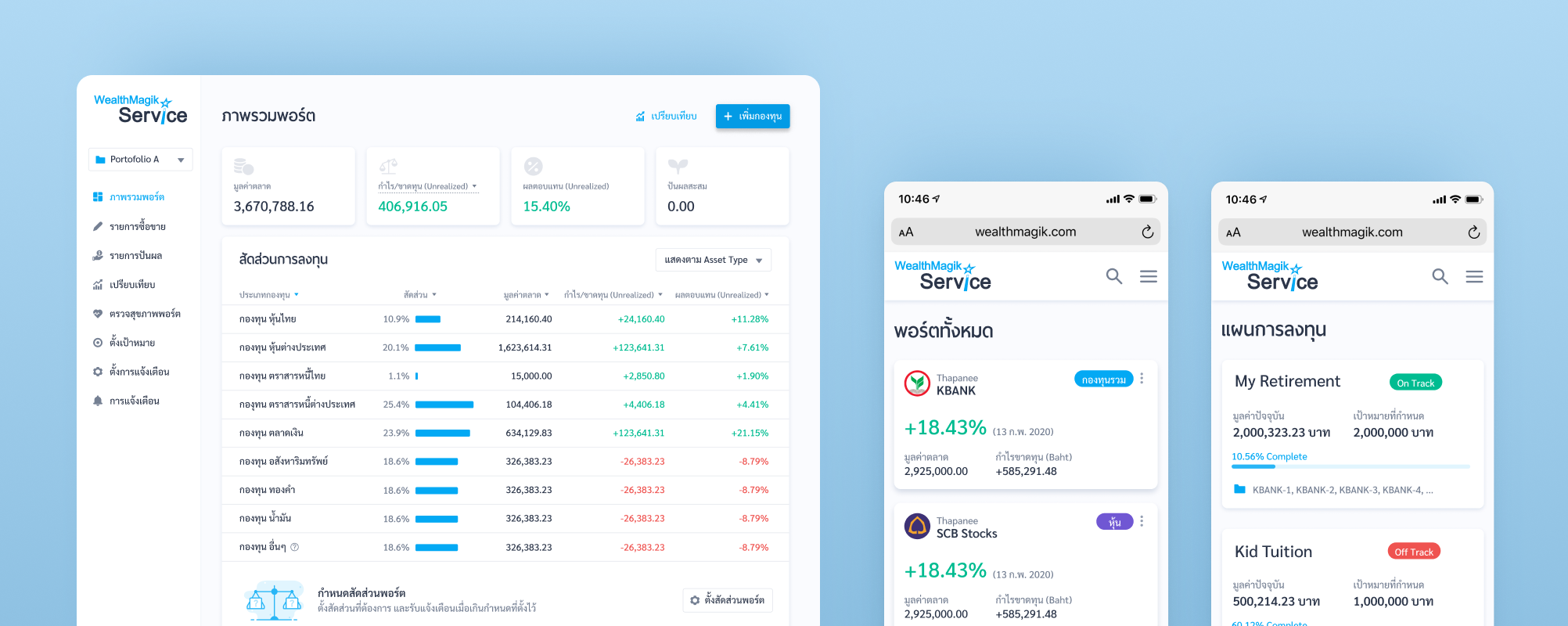
WealthMagik.com is a popular website amongst Thai investors for mutual fund data. Their team needed help solving how they could increase the adoption rate for their portfolio management feature called “WealthMagik Service.”
Identifying What to Solve
We conducted user testing with the existing feature on their website to discover what might be responsible for the issues many of their customers were facing and what friction might be causing customers to drop off. We found that the usability issues could be best categorized into 4 categories: unclear visualization; unclear visibility of interaction; mismatch with user expectation; and unclear naming & lack of clarification.
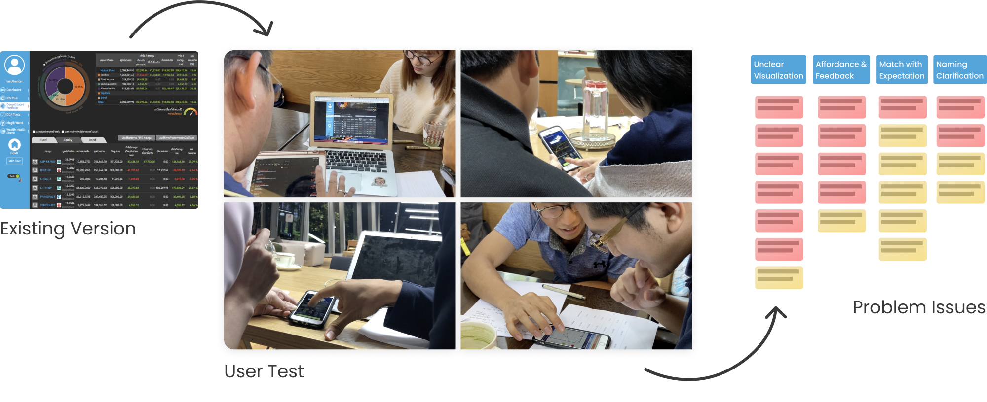
Problems & Solutions
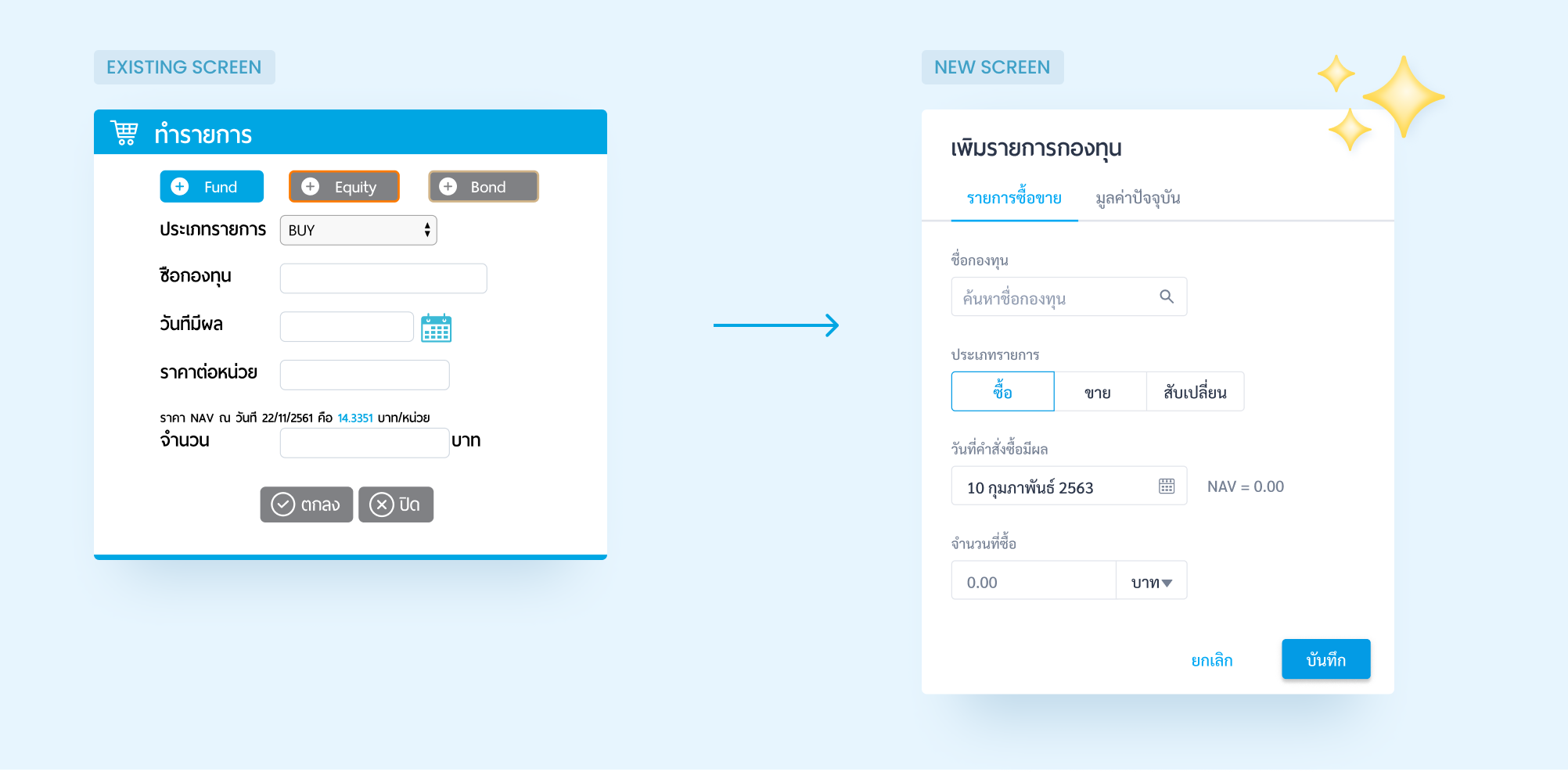
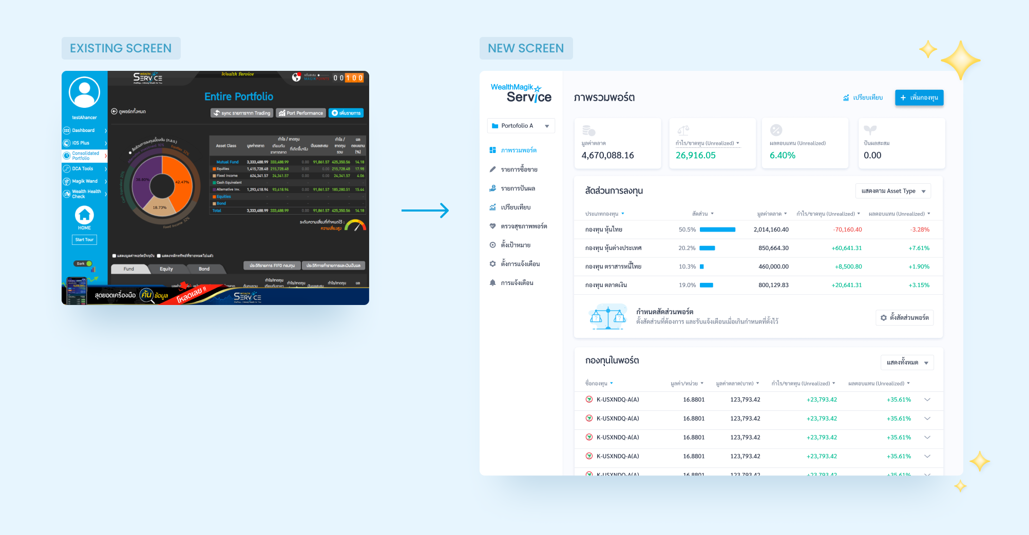
1. Large barrier to adding portfolio
In the existing feature entering transactions is very time consuming. Users had to individually add each transaction. For many users who have owned multiples funds for many years, we added feature that allow user to input just the current value of their fund in order to save their energy.
2. Confusing portfolio dashboard
The existing dashboard was very overwhelming with so much information that many users did not know what to look at or what the small nuances all meant. Furthermore, the portfolio allocation which showed people’s allocation by broad asset classes did not match how many users conceptualize their portfolio. We revise the dashboard by organizing its information to better match our user’s persective.
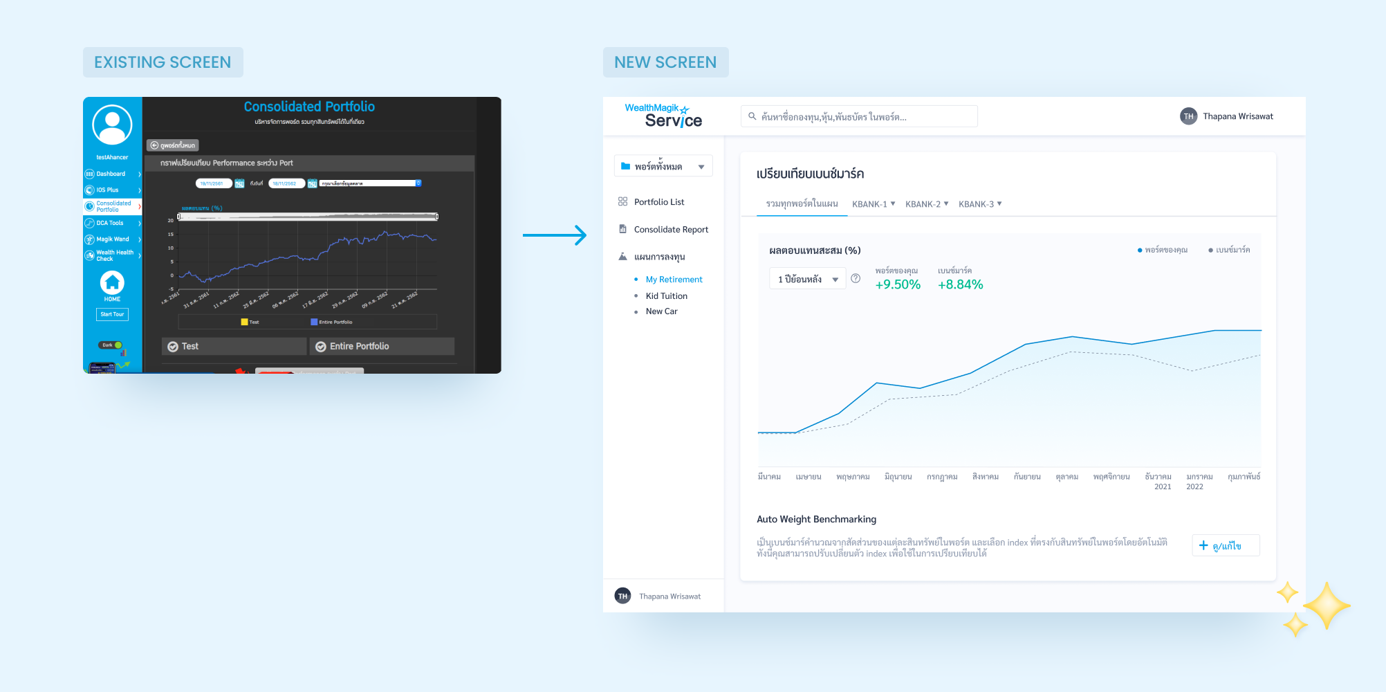
3. Need to benchmark with relative peers
Most savvy investors desire to compare their portfolio to benchmarks of relative peers. Furthermore, many users don’t just want to compare their overall portfolio performance but want to see individual fund performance. This means the ability to analyze how well a portfolio performs in the long term is not enough, investors emphasize having real-time monthly insights on how their funds are performing to be able to change their strategic allocation accordingly.
Our Process
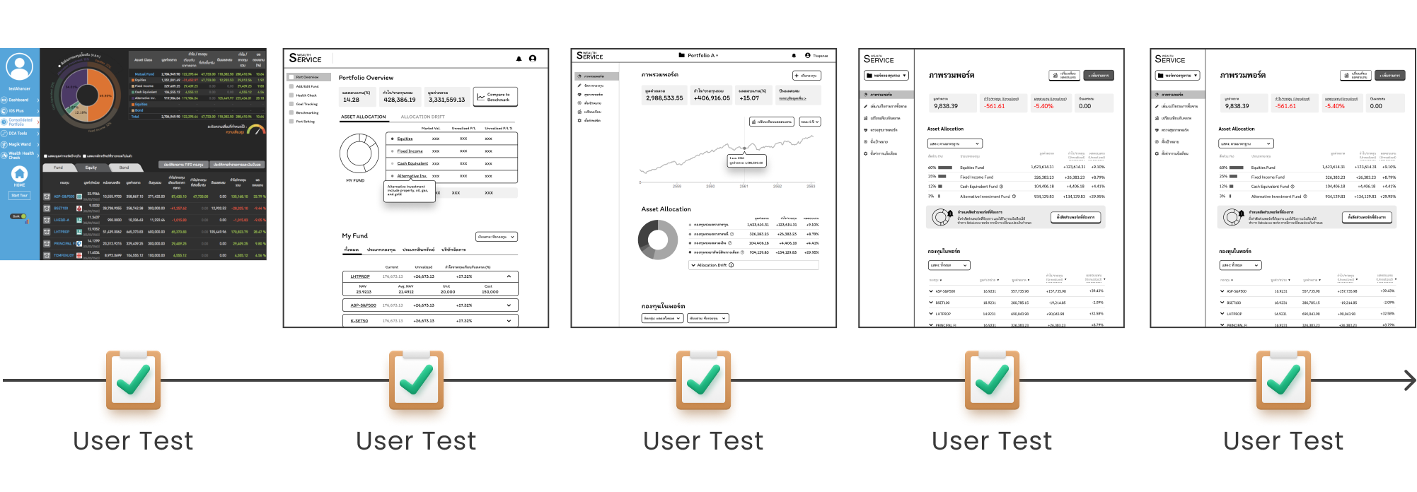
For this project we spent a total of 4 weeks for the Discovery phase and 6 weeks for the Design phase.

Discovery
The goal of our discovery phase for this project was to:
- Through user research identify which types of investors would be most likely to use this feature.
- Map out investors as-is journey and identify their current pain points so that we could craft a to-be journey.
- Discover what usability issues existed with the old Wealth Service so our redesign could address it.
- Ideate and test our wireframe concept with actual users.
Design
With a validated concept from our Discovery, the main objective here was to turn these low-fidelity wireframes into a UI screen that still maintained the desired goals of each page. We designed primarily for the desktop but also kept in-mind to make our designs responsive for the mobile since some features such as portfolio overview many investors would want to have a look on-the-go. We also tested a UI version of our prototype to ensure that we caught any usability issues early on before development.